| . |

| US Federal Government Public Debt - 42 Year Graph |
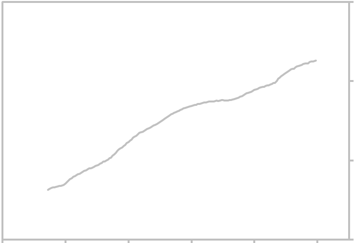
| US Public Debt Graph |
The above graph shows quarterly US Federal Government Public Debt in logarithmic scale.
Measurement is in Trillions of Dollars (not seasonally adjusted). Updated Thursday, March 30, 2018.
Click the links below for the forecast and other pages related to this economic indicator.
Measurement is in Trillions of Dollars (not seasonally adjusted). Updated Thursday, March 30, 2018.
Click the links below for the forecast and other pages related to this economic indicator.
| 1 |
| 100 |
| .1 |
| 10 |
| 10 Year Chart - Current National Debt 42 Year Graph - US Public Debt |
| ||||||||||||||||||||||||||||||||||||||||||||||||||||||||||||||||||||||||
| ______________________________________________________________________________ Search Report a Problem with this Page Site Map Contact us Privacy Policy Terms of Use/Disclosure SignalTrend Inc. 2008 - 2015, All Rights Reserved |
1/65
| 1/1975 |
| 1/1985 |
| 1/2005 |
| 1/2015 |
| 1/1995 |