| . |

| Total US Population (All Ages) - 56 Year Graph |
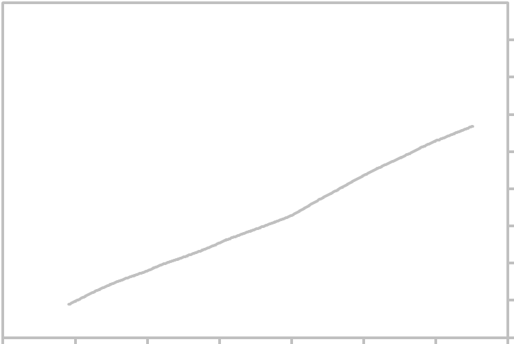
| USA Population Growth Graph |
The above graph shows monthly Total USA Population Growth (All Ages). Measurement is in
Millions. For the forecast and other links related to this economic indicator, click the links below.
Updated Thursday, May 31, 2018.
Millions. For the forecast and other links related to this economic indicator, click the links below.
Updated Thursday, May 31, 2018.
| 330 |
| 360 |
| 390 |
| 300 |
| 270 |
| 240 |
| 210 |
| 180 |
| 150 |
| 10 Year Chart - US Population Growth 56 Year Graph - USA Population Growth |
| ||||||||||||||||||||||||||||||||||||||||||||||||||||||||||||||||||||||||
| ______________________________________________________________________________ Search Report a Problem with this Page Site Map Contact us Privacy Policy Terms of Use/Disclosure SignalTrend Inc. 2008 - 2015, All Rights Reserved |
1/50
| 1/1960 |
1/1970
| 1/1980 |
| 1/2000 |
| 1/20 |
| 1/2010 |
| 1/1990 |